- Home •
- Books by Category •
- Imprints •
- News •
- Videos •
- Media Center •
- Reading Group Center
Notes from the Rough Front: Adventures in Typography

When you open a book, your eyes see letters strung together to create words on a page, numbers in corners, sometimes images pointing the way, and paragraphs building stories. You don’t notice the curve of the A, the space between the letters, or the position of author’s name, or chapter headings. You just follow where the writer’s words lead. Except when it is done badly . . . then you may stumble and struggle with the text.
Why is this rare occurrence for most readers? The answer: good book interior design. There are plenty of great book interior designers with a variety of styles, skills, and artistic influences that work here, but all are passionate about one thing: how words look on the printed page. Interior book design—the art of laying out a manuscript—is the key to creating a beautiful book.
Great design, be it clothing, a room, an office tower or the pages of a book, coveys emotions, history, or aesthetics. A well-designed book is pleasing to the eye and seeks to tap into the reader’s mind. The layout and design should suit the writer’s content. A book interior designer has to know their audience and illustrate the purpose and idea of the content through their design. For example, when the designer is working on a book for children, they will use a larger font than in a collection of academic articles to make easier for little learning eyes and mind. In a cookbook, they might set the list of ingredients apart from the instructions so the reader will know what to buy to embark on their next gastronomic adventure. Screenplays, chapter books, and travel guides all require different styles of instructional design, each with a set of elements detailing the priorities and the flow of the content.
All of the design’s success rests on understanding what appeals to the reader’s senses and expectations. If they are going to read a bodice-ripping romance set in Regency London, they don’t expect see bold and block letters running throughout the pages; instead the reader might expect to see a calligraphy font in a chapter opener or heading. Imagine reading Shakespeare’s plays looking like graffiti on a city wall. Wouldn’t that font look out of place? People go to the bookstore, open up a book that piques their interest and might decide that the font is too small or the words are too cramped for them ever to read, even if they might be delighted by the content. To get you to buy it, the book’s design has to reflect its message and your reading tastes.
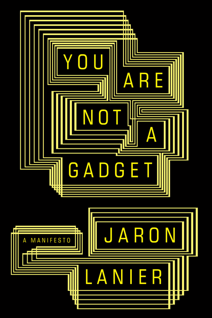
 Case in point: You Are Not A Gadget by Jaron Lanier is a manifesto against the web’s growing compulsion toward the crowd-sourcing hive culture and consumerist social media. Lanier discusses what he sees as flaws in web 2.0’s “open culture”: the minimization of working artists, trolling of chat rooms and our humanity in general. He also states that technological decisions of today are based on flawed technologies of twenty years ago. He offers and suggests a more humane Internet that acknowledges content creators and allows us to keep our privacy without giving up the pleasures of digital social connection.
So how does a book interior designer convey the treatise of a writer who worked on the early incarnations of the Internet and is considered the father of virtual reality? In this case, you start with selecting the right typeface and its fonts.
A typeface is an assortment of characters all of one style and sometimes one size. A font is a collection of letters, numbers, punctuation, and other symbols used to set text (or related) matter. Although font and typeface are often used interchangeably, font refers to the physical embodiment while typeface refers to the design. For example, Times is the typeface and B Time Bold is font. A typeface is what you see and a font is what you use. The designer has to pick a typeface and font that reflects the ideas in the manuscript or plot, nuances of the genre or simply the writer’s aesthetic. Subconsciously, framing the world that is reflected in the writer’s words.
For You Are Not A Gadget, our intrepid book designer Maggie Hinders went back to the early nineties for inspiration. Remember Nintendo, Atria and DOS? Remember how the words looked to you as you read the clues or instructions for the next level? Remember the blinking cursor box as you slowly type in your initials into the winner’s section on the arcade machine? Remember when your techie friend rescued term paper or an excel file from a virus that was slowly corrupting the various files on your PC? Seeing the blocky glowing letters against the ink black background once the user-friendly interface was out of the way and realizing how much trouble you might be in?
Early gamers, arcade aficionados, and techies like Lanier and his brethren would most likely recognize and associate it with the technological world they inhabit. Stripped of all the things that make the modern computer usable by neophytes, luddites, and the general public, down to algorithms and programming codes that are the building blocks of the modern Web.
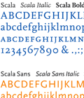
While I can’t tell you what exact text typeface that was used in the early incarnations of video games and computers, the designer used a typeface that could be mistaken for its more refined cousin. Scala is an old style typeface designed by Dutch graphic and typographic designers in Utrecht, the Netherlands, and released by the FontFont Foundry in 1993. Vredenburg Music Center was one of the first in the Netherlands to use an Apple Macintosh computer for its printed materials. The fact that there were only 16 typefaces available without features like old style figures, small caps and ligatures, influenced Majoor to decided to create his own typeface. Scala is one of the first typefaces in what is now part of the historical evolution of digital typography.
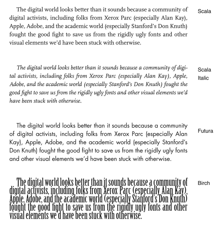
Below are three lines of the text from You Are Not A Gadget. The first portion is in the original typeface printed in the book. The following are examples of the text lines reproduced with different font and typefaces to show how typography’s effect on how you read:

It’s neat, ain’t it? What a difference a typeface makes. . . .
By choosing the Scala typeface, Maggie had the opportunity to frame the fundamental issues discussed in Lanier’s manifesto. The typeface evokes the early days before software and technology were, as Lanier explains in his book, “locked-in [. . . before] the technical and cultural problems that can grow out of poorly considered digital designs.” The text design hearkens back the web before it became a set of, in Lanier’s view, flawed technologies and economic demands driving the hive mind to slowly impose its will on individual creativity and thought.
As the talk of redesigning the web gains momentum in the digital community, Lanier seeks to remind us to go back to the creators’ early intentions. To create open space where all human beings could thrive with technology helping, not dominating, the cultural conversation.
As a reader, You Are Not A Gadget forced me to think about the domination of tech talk in my own life. Using Facebook and Twitter, I am easily absorbed in the digital community, just a click away from a window into my friends’ lives, their thoughts on the news, or simply where they are in the physical world. Or when researching something, I start to believe that Wikipedia is a perfectly legitimate place
for “expert” information. But as I read Lanier’s polemic against the inadvertent seductiveness of Web 2.0, I had to stop and think about my own actions and assumptions as a participant in the technology. How much of my private life and information is out there to be found? Are Wikis analyses or subjective information mixed in with facts and figures from a collection of opinions? How am I allowing the “hive mind” to shape my knowledge and cultural ideas with all its biases intact? And how did I go from being a web cynic to a web convert?
Knowing the designer’s decision to use the Scala typeface forced me to remember I was reading about technology, not about some historical figure or fictional town. Maybe the text design gives readers the distance we lack when using the tools of web 2.0’s technology. In a way, the typeface choice pushed me to take a step back and see the technology for the bits and silicon chips it is, not the user-friendly interface we mistakenly think are our friends reaching out to us from across the digital noosphere.
Amazingly, that’s the power of a typeface and its fonts.
Buy the book: Amazon | Barnes & Noble | Borders | IndieBound | Random House