- Home •
- Books by Category •
- Imprints •
- News •
- Videos •
- Media Center •
- Reading Group Center
The Transformation of Stieg Larsson’s The Girl Who Played with Fire jacket
At the heart of Larsson’s second book is one major mystery: who is Lisbeth Salander? Larsson sheds the image of Salander as merely a bisexual computer hacker, and starts to reveal the details that make up the “girl” who dominates our imaginations, as she shifts from a sidekick role to that of the lead protagonist. At the end of the first volume, Salander disappears to parts unknown; in the opening pages of the second volume, we come face to face with her, now blond and with a transformed body, but still acutely herself. We watch as she transforms further into an avenger. That transformation is the inspiration behind the jacket design for The Girl Who Played with Fire.
The design concept was fairly easy to come up with according to Peter Mendelsund, but execution is where things got interesting:
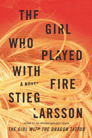
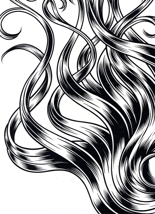
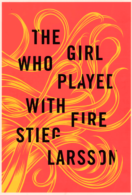
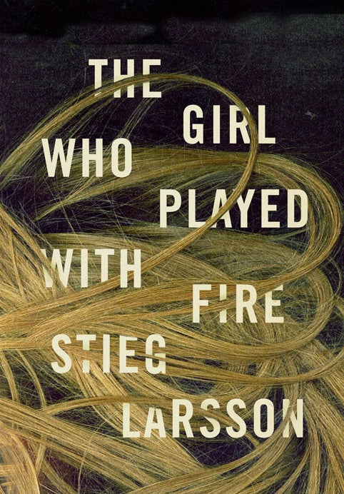
“With the second Larsson in the series, The Girl Who Played with Fire, I got off to a good start, but hit some snags along the way. The concept of using the main character, Lisbeth Salander’s hair (a blond wig she wears as a disguise) as a metaphor for the fire of the title came to me right away. My younger daughter Violet was visiting the office, and her hair was just insane looking that day. So I snapped a photo and put in the type, all the while thinking that this comp would be merely the basis for an illustration. We hired someone to draw the hair, and it looked gorgeous. But in the interim, everyone here had fallen in love with the original photo. So we went back to it. Except the original background was black and I was told the cover needed more color. (Truth be told, I really prefer the original dark version). It took a long while and a ton of effort to get this cover to be the red it is today. But people seem to like it, so who am I to argue? For me, the real reward is that people are constantly telling me “I really love the cover you did for ‘The Girl Whose Hair Was On Fire.’” They seem to think this is the actual title.”
See the evolving jacket image through Peter’s eyes:
 . . . . . . . . . . . . . . . . . . . . . . . . .
I understand that Peter’s preference for the yellow-on-black, but I find the red background extremely evocative of blood and fire, and of an imminent attack. The natural highlights of Violet’s hair were lightened, making it blonder and, against the red background, seeming like flames licking and consuming the title. With the red background and beautiful image of Violet’s hair in the foreground, the title type (which matches that of the first volume) could have been lost. But Lisa Montebello, production manager on the trilogy, bumped up the black ink and used matte UV (a special type of lamination) on the title type to make it readable from any vantage point. The final gloss over the entire jacket gives the impression that you are holding glowing embers in your hands.
Peter’s design finally put a girl on the cover of our edition, something we hadn’t done with the first volume. However, we did it in a very different way than some people might imagine. The Knopf edition offers the reader a riot of hair and heat, and deliberately evokes the crime scenes that frame the novel. The golden hair splayed across the red background (though orangey-red, it may as well be blood spreading across the floor) looks like a photograph taken by a forensic scientist, of a murder victim with a gunshot wound to the head. The imagery is influenced by the acts of violence the women in the novel suffer. In this volume (unlike in the first one), we are pretty sure the girl in the title is Salander, but she is not the only “girl” to play with fire, not the only one to suffer a bullet wound to the brain. Mia Johannsson, the source of the data about the sex trafficking industry and the murder victim that propels the story along, could also be the girl in the title.
By the time I finished the novel, it was impossible for me not to see this jacket as anything other than a crime scene photo. The symbolism of the gunshots to the head couldn’t be clearer: in this novel, misogynistic men and corrupt governments are out to destroy and silence their female victims. They wound and kill these women in an attempt to shut them up, to keep them from telling the truth. But both Lisbeth and Mia fight back by writing down and branding the truth in ways that cannot be ignored.
Peter took a shot of his daughter’s hair and transformed it into a jacket so provocative that it inspired me to see several images all at once: a moment of horrific violence, the morphing of a young woman’s self-image, and the elemental power of fire. A picture of a little girl’s wild hair day captures moments of transformation that represents all the nuances of “the girl.” Read as Salander, the blond hair is a sign of growth and change, a new (albeit temporary) look for her as she considers her next move. Read as Mia, that same image becomes a sign of her death and destruction. As in The Girl who Played with Fire, the sense of transformation and shifting dynamics that play out in the novel gives Peter’s jacket treatment its power.