- Home •
- Books by Category •
- Imprints •
- News •
- Videos •
- Media Center •
- Reading Group Center
Designing the interiors for The Sushi Experience
by Iris Weinstein, Senior Designer
My Role at Knopf
Designing interior layouts for books is like putting together a jigsaw puzzle. My function, as a book designer, is to try to get all the elements to coalesce on the page spreads, to make the text easy to read and to allow the reader to follow the photos in sequence during recipe preparation.
The Early Stages
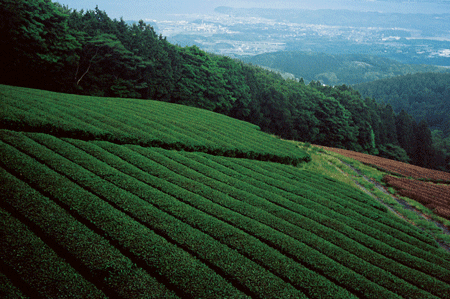
In early spring 2005 I was overjoyed to learn that Knopf was to publish a sushi cookbook and that I was chosen to be the designer. I am the ultimate Japanophile, having made 4 extended visits to Japan, crisscrossing the country and seeing sights even most Japanese don’t get to see. During my first trips, I focused on photography, textiles, crafts, and architecture. Once I learned I would be working on The Sushi Experience, I focused more on sushi, miso, sake, and tea: all topics that are covered in the book. Japanese friends introduced me to specialists. Mari, in Kyushu (southern Japan), introduced me to a friend who owns a tea plantation.
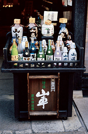
In Takayama, Kazuo took me to see various kinds of sake.
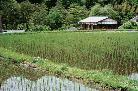
I visited various sushi restaurants, miso factories, and rice paddies in Kamakura, Kyoto and Tokyo. You can see some of my photographs from these trips in the finished book.
Color
Designing The Sushi Experience was a labor of love. I have many picture books on Japan and decided to use traditional Japanese textile patterns as chapter openers and section dividers. I wanted the colors to have a transparent, gauze-like quality to convey the subtlety of the culture.

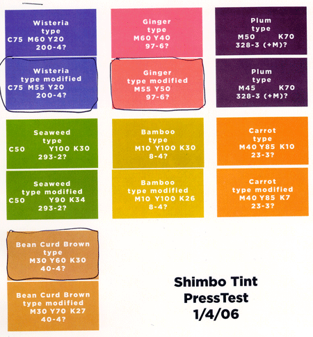
Developing the color palette was a lot of fun for me. I used colors found in Japanese foods and utensils to create an atmosphere that was traditional, but also modern and fresh. I even named the colors: green tea, ginger, wisteria, egg, bean curd, plum, bamboo, carrot, and seaweed. Andy Hughes, Director of Knopf Production, and Dennis Bicksler, Prepress Manager at Knopf’s typesetter, North Market Street Graphics helped get it right.
The design layouts were approved by the editor, Judith Jones, and the author, Hiroko Shimbo, in October of 2005. Both were enthusiastic about the way I styled the book, but they had some suggestions. As a result, I made numerous changes: I enlarged the size of the sequential photos, and what was a two column book morphed into a three column book. The additional column allowed for more flexibility when laying out the photos.
Photos
Of course, before I came on board, The Sushi Experience was already in the process of becoming a book. There were many manuscript revisions, and several photo sessions had already been scheduled. I was able to attend two days of shooting. These sessions were like attending a private sushi-making school.
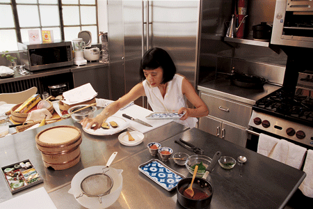
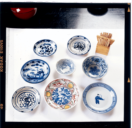
Every detail of handling the rice, fish, vegetables, and condiments is discussed in detail in the book, and it all had to be carefully demonstrated for the camera as well as explained in the text. Photographer Jim Smith and his assistant Ryan Basten brought various fabric backdrops and we were able to shoot at Hiroko’s home and studio where we had access to many unique bowls, chopsticks, tea caddies, and cooking implements.
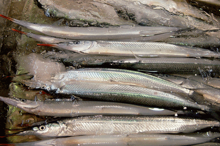
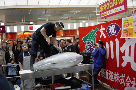
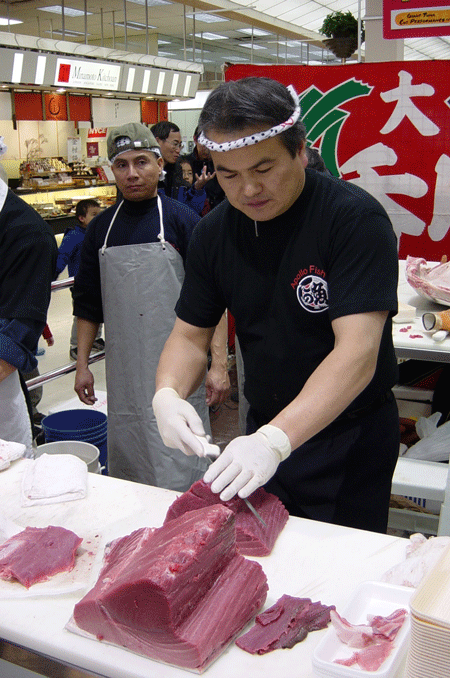
I knew that detail photos of these items would give more flavor to the book’s design when used as ornamental touches throughout. Luckily, in March and April 2005, during development of the book, Hiroko was in Japan and was able to take many photos of various seafood species at the famous Tsukiji fish market in Tokyo.
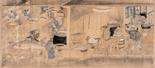
She also scoured the local museums for historical woodblock prints and drawings which depict rice growing, harvesting, cooking, fish preparation, and sushi making.
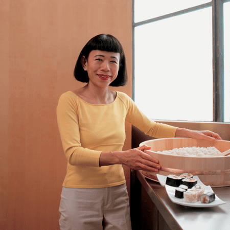
While I was reading the manuscript and working on the design, I was inspired to purchase a new electric rice cooker and a sushi-oke “tub” for preparing the rice. It’s the kind of tub that appears on the jacket photo.
Using recipes from the book, I had a sushi making party at my home. We had a lot of fun, and even though much sake was consumed, we managed to get a photo from the party to use in the book.
In August 2005, the photos were assigned their placement in the manuscript. There were many outtakes and alternate views that I had to choose from. I learned a lot reviewing all the photos—for instance, there are subtle differences in how rice looks when properly cooked (it should be glossy and somewhat transparent.)
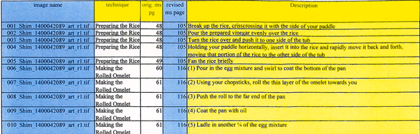
Ken Schneider, editorial assistant to Judith Jones, organized all the photos and after many meetings and discussions between editor and author, was able to transmit a meticulous “art log” in November 2005.
The job of writing the captions was still to come after the very final selection of photos was made. The final copy-edited manuscript was delivered to Knopf December 21, 2005. After hours of consultations, Kathleen Fridella, Knopf Production Editor, was able to release the manuscript to me for marking up and transmitting to the typesetter.
More Color Work
Between November 2005 and January 2006 the color issues were ironed out. We consulted Tien Wah Press, our printer, and after many tests in Quark and Photoshop, process tint variations were submitted by Dennis and we were ready for press tests. We were looking for verification that we specified the color hue and strength correctly and that the printed version would match the conceived version (the version seen on the computer screen.) There are many printing variables involved in color matching, and Andy encouraged minute changes to achieve the exact color blends that you see in the final book. He decided to use Stochastic screening when imaging plates for offset printing. The Sushi Experience was the first book Knopf produced using this imaging technology. Stochastic screens and CTP (computer to plate) are state of the art processes implemented to achieve optimal print quality.
I created about sixty pages of samples to be shown at the Frankfurt Book Fair to recruit foreign sales and also made an 8 page sales “blad” (brochure) that would be sent to potential booksellers and for promotional use. The blad, completed in February 2006, was helpful because it uncovered some new issues regarding silhouetting (separating the image from its background) and the color of the vignette borders when printed on the same page as a photograph.
Layout
When the first loosely paged “galleys” arrived in February 2006, my real work began: laying out the recipes in three columns and adding the instructional and decorative photos and captions. Running as “sidebars” to the main text are three kinds of explanatory text: historical (wi
steria colored boxes), instructional (ginger colored boxes), and professional (egg colored boxes). These had to be incorporated into the design of the book.
Finally: The Jacket
Knopf Art Director Carol Carson designed the beautiful book jacket. There were two final details to design: the hardcover case and jacket flaps. For the pre-printed hardcover case I chose an historical wash drawing of sushi preparation.
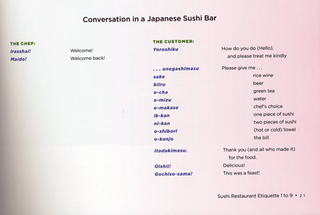
The jacket flaps were more complicated. Judith suggested it would be great fun to include a cheat-sheet (16) for readers to bring to sushi restaurants to help them communicate with and order from the sushi chef. We proposed bookmark-like cards, but Andy suggested printing larger jacket flaps that could be perforated. After a lot of engineering, special perforated tri-fold jacket flaps that fit into a small envelope on the last page of the book were created.
And at long last, the book was complete.