Reading Group Center
- Home •
- Books by Category •
- Imprints •
- News •
- Videos •
- Media Center •
- Reading Group Center
Uncovered: A Look at the Design Process for The Hopefuls
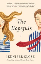
The Hopefuls by Jennifer Close is a witty and poignant novel that follows Beth and Matt, a newly married couple, as they pick up and move from New York to Washington D.C. While Matt is following his political dreams, Beth begins to hate everything about her new city: the Ann Taylor suits, the traffic circles, and the pervasiveness of politics, even at dinner parties. In honest and funny prose, Close reveals what happens when politics, jealousy, ambition, and marriage intersect in our nation’s capital.
Designer Kristine Brookshire took on the challenge of creating a book cover that would represent this story. Once we saw the design, we were dying to know more about how she created this concept. Kristine was kind enough to answer some questions for us about her process. We also have a time-lapse video of the cover creation so you can see the artist at work! Find it here.
Reading Group Center: How do you usually begin your creative process for a new project?
Kristine Brookshire: I’m always collecting “visual data” that inspires me, whether it’s a color combination, a mood-board, a pattern on a dress…. I also keep little sketchbooks around the house to jot down ideas so I don’t forget them.
RGC: What was your favorite part about creating the cover?
KB: I think my favorite part was that the painting would end up as a physical, three-dimensional product. I love that her face wraps around the spine of the book in hardcover; it’s the definitely the cutest book I’ve ever seen on a shelf.
RGC: What was different about painting for a book cover instead of making a standalone print?
KB: It was different in that these characters were Jennifer Close’s creations and already existed in the story. I had the amazing responsibility of creating what Beth and her husband looked like, and providing an image for these characters that the readers will get to know. And at the same time, I had to capture a wistful, hopeful expression on their faces to match the title of the book.
RGC: The Hopefuls cover is done in watercolor. Is that the medium you like to work in the most?
KB: I love the organic, watery, sometimes unpredictable interaction that watercolor provides. I’ll often use watercolor on paper and combine it with chalk pastel or charcoal drawing. Sometimes I’ll even use watercolor on my large-scale canvas paintings when I’m working with acrylic paint. It’s definitely been my go-to the past couple years.
RGC: Where do you draw your inspiration?
KB: My paintings are almost always figurative. I’ve always loved to draw and paint people, ever since I was three years old. When I go to the local beaches with my family, I walk the beach and take pictures of the people lying out on towels or interacting with the ocean. I’ve been having fun painting beach scene paintings from those photos. I’m such a fan of Pinterest too, mainly for gathering ideas for interesting color combinations. Fashion, graphic design, and interior design are all sources of inspiration for me. When it come times to actually implement my ideas, I usually end up painting female faces or figures, usually pushing them a little towards abstraction, but I’m always inspired by the human figure.
For more from Kristine, visit her website, Facebook and Instagram pages.