Notes from Paperback Cover Designers
Have you ever wondered how the cover design process works? Or asked yourself who dreams up the aesthetic concepts in the first place? Well today is your lucky day! We’ve asked four of our in-house paperback cover designers to give us a behind-the-scenes look at their design process and specifically speak to the inspiration behind a few recent titles. We hope you enjoy this deep dive into the artistic minds that created the book covers you’ve come to know and love.
Maddie Partner
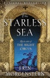
The Starless Sea by Erin Morgenstern
The Starless Sea is a book that contains a multitude of worlds, where a character could turn a corner or open a door and find a completely different land before them. It was clear to me that Erin’s imaginative and complex world-building should be emphasized on the cover, and so it was just down to finding the right illustrator for the job. I stumbled upon the work of Alex Eckman-Lawn, who is known for his fantastical, layered paper collages. Erin already knew and loved his work, so it was a perfect match! Alex created a few different compositions for us, but we went with this option because it best embodied the adventurous, magical spirit of The Starless Sea. I decided to use the base artwork of the blue ship on the stepback of the book, so it’s as if you’re opening the door to an otherworldly universe when you pick up the book.
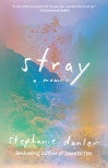
Stray by Stephanie Danler
After exploring a few different directions for Stray, I figured it would be best to use a piece of fine art on the cover—something that just hinted at California and embodied the mood of the book. I’ve followed photographer Terri Loewenthal’s work for a while, and I thought it would be perfect for Stray. Loewenthal creates her dreamy “psychscapes” entirely in-camera, using a single exposure film technique that she developed. I selected Psychscape 48 (Lookout Mountain, CA) because of its unique colors and how the composition highlights the landscape while also providing enough room for type placement. It’s always satisfying to use a favorite artist’s work on a cover, and I’m so happy with how it ended up here.
Emily Mahon
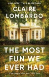
The Most Fun We Ever Had by Claire Lombardo
I worked on both the hardcover and paperback for this debut novel. I loved this family saga! For the jacket I wanted to represent the four sisters conceptually and the gingko leaves were very much a part of the story. I was asked to change the cover for paperback and focus more on the setting. I found this image of a house which felt to me so much like the one the Sorensons lived in—where the sisters grew up and their parents still lived. Ultimately this is a story about home. This particular house felt right stylistically and emotionally, with the leaves adorning the lawn. Typographically I just wanted to keep things big and very clean, since the title is so monumental.
Linda Huang
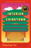
Interior Chinatown by Charles Yu
My cover is an alternative take on the existing hardcover. I wanted to make it look more contemporary and, through the vertical bars in the pagoda, highlight the “mental prison” that the protagonist finds himself in. As well as a nod to the Hollywood sign, the type was also inspired by a legendary (now defunct) floating restaurant in Hong Kong called Jumbo. After some initial sketches, I was pleased to discover this quote by Yu in the Los Angeles Times that completely supports this aesthetic:
Yu’s Chinatown is an amalgam, based less on any geographical place than on a state of being. “It exists in a mental space,” he said, “a kind of collective imagination for Asian Americans who grew up in my generation, feeling like you don’t exist fully inside of America. The closest analogy I could come to is something like a cartoon, where the rules of physics or logic don’t always apply and you can walk from one room to another plane of existence. . . .
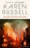
Sleep Donation by Karen Russell
Karen Russell commissioned the Italian collage artists Ale+Ale to illustrate the interior images—their surreal photomontages were a perfect fit for the author’s dystopic novella. It was only fitting that we use them for the cover as well. I paired a vaguely futuristic, off-kilter typeface with their nightscape. The richness of the image contrasts nicely with the minimal type panel.
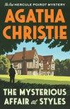
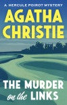
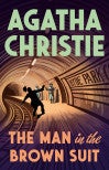
Agatha Christie reissues
The publisher wanted these reissues to look “warm and cozy,” so we hired British printmaker Chris Wormell, known for his graphic landscapes, to create full-bleed art that would accommodate large, inviting typography. The covers feel comforting and familiar, like catching up with an old chum.
Mark Abrams

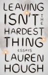
Leaving Isn’t the Hardest Thing by Lauren Hough
Leaving Isn’t the Hardest Thing is a collection of funny, often acidic, sneakily (or not so sneakily) intimate essays by Lauren Hough. Reading a Hough essay feels like catching up with an old friend in a dive bar; the drinks are cheap but strong, and you’re hearing some eye-popping yarns. Maybe there’s a flickering TV showing some disturbing national news in the background as well, and there’s an uncanny parallel to all the yarns you’re hearing.
There seemed to be a couple of directions the cover design could go (I found inspiration in Jack Chick comics, weirdo fringe cult poster design, and broken crosses), but the agreed upon design centered on Hough’s well-known essay—as a “cable guy,” wandering through America’s underbelly as a cable technician.
This design featured the title and author in large wire type made by the wizards at a type studio that transmogrifies type out of every conceivable fabric and material out there, including, happily, cable. Hough liked her wire type cover but—true to her cable repair know-how—was wondering if maybe the ends of the frayed wires could look more like coaxial cables . . . with silver and copper ends. You know, like the classic coaxial cable that connect to TV sets, as everyone knows. Oh no.
Lightly grumbling, I set to work spiriting the little red and blue circuits away and ushering the silvery coaxial endings in. Also, following a clever idea of the editor, Tim, I added some sparks, and a little smoke for good measure. Bzzttt. This added the dollop of energy to communicate the live-wire energy of Hough’s voice, and the design was enthusiastically approved.